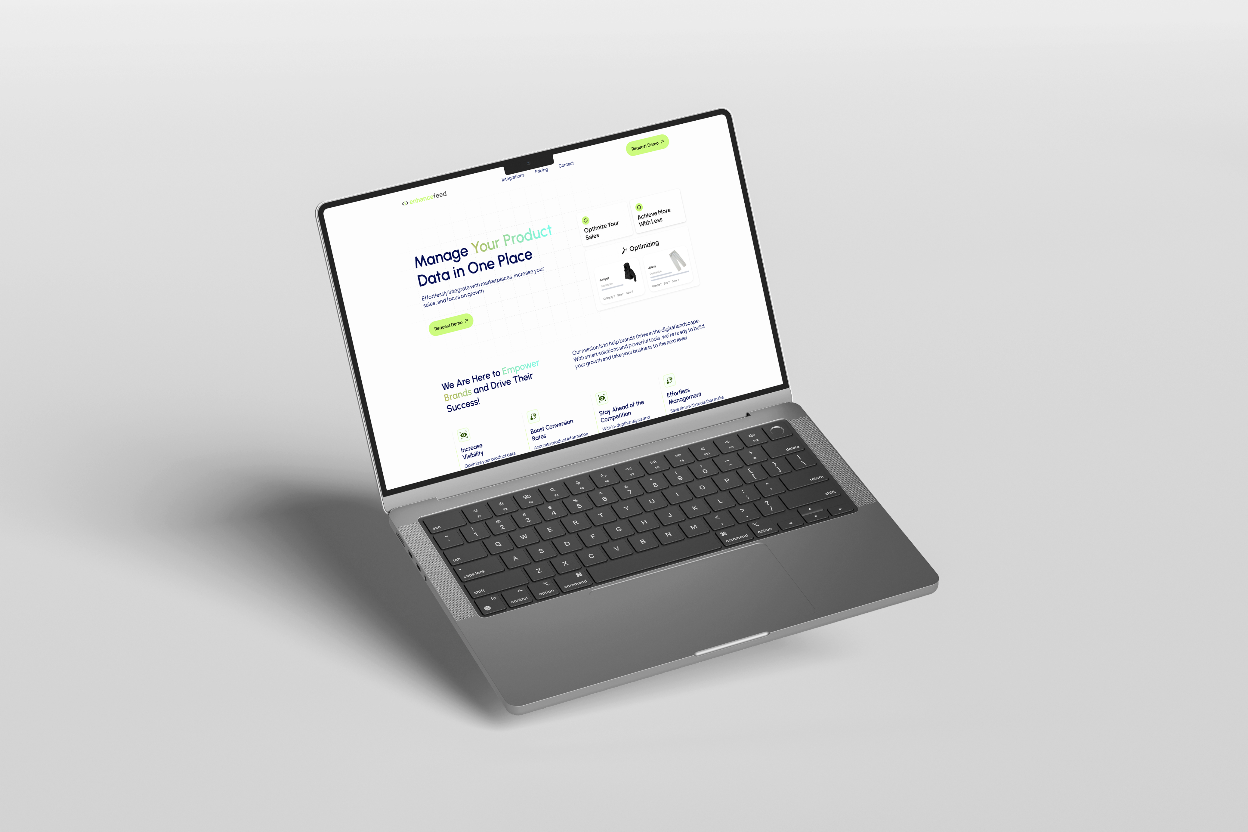
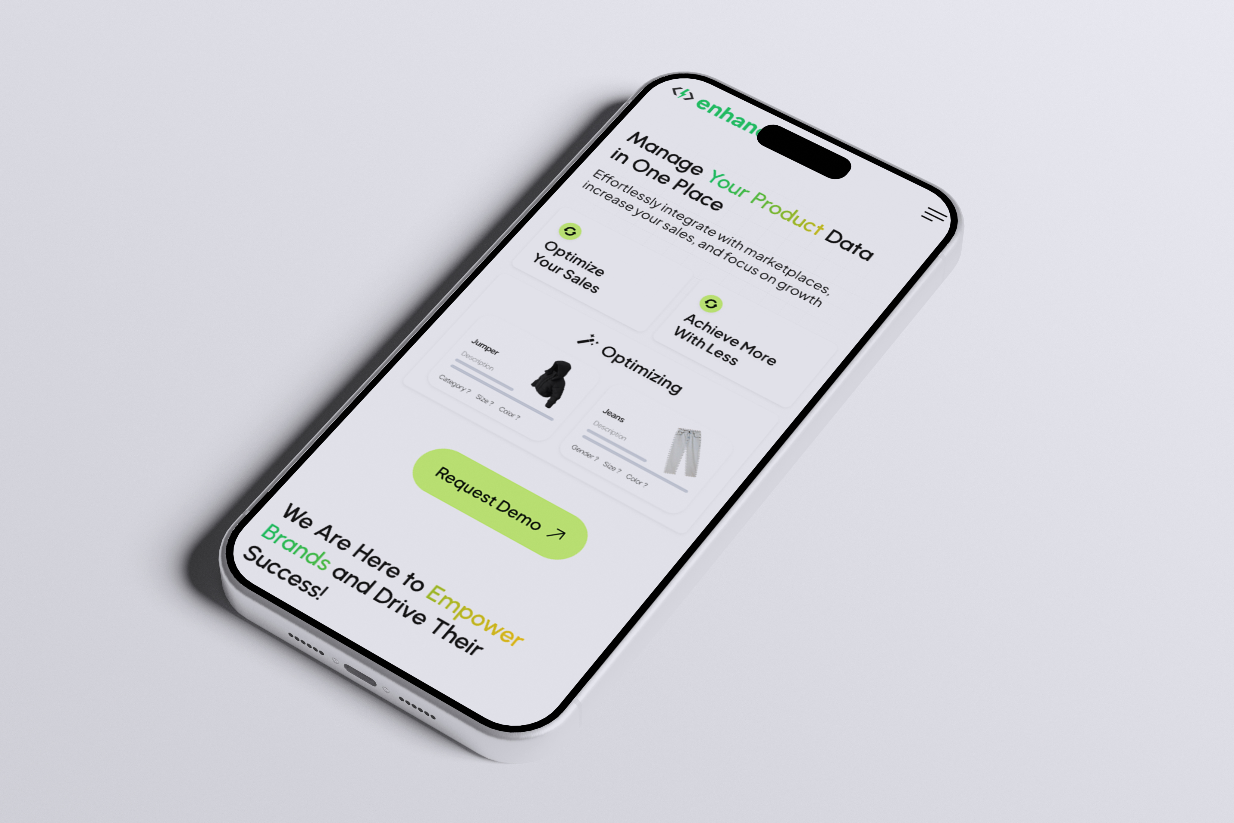
EnhanceFeed is an AI-powered platform that helps e-commerce brands optimize their product data to run more effective ad campaigns across platforms like Google and Meta. In this project, I was responsible for developing the entire front-end based on a Figma design. Using HTML, CSS, and JavaScript, I built a fully responsive and user-friendly interface. I focused on layout structure, interactive elements, and mobile responsiveness to ensure the design was implemented accurately. Throughout the development process, I prioritized visual consistency and performance to deliver a modern and seamless user experience.
Before starting the project, I carefully reviewed the design files (mostly in Figma). I analyzed the page structure, grid system, color palette, typography, and the components to be used. I identified key areas from a user experience perspective and noted which sections would require interactivity and which components could be built in a reusable way. By comparing the mobile and desktop versions, I planned responsive behaviors in advance. This preparation phase helped me anticipate potential challenges during development and allowed me to build a cleaner and more maintainable codebase.
After reviewing the design files, I created a basic folder structure tailored to the needs of the project. I organized the pages under the pages directory, keeping each route in a separate file. For static assets such as images and icons, I used the assets folder, and I stored all styling files within the styles directory. To keep the project clean and easy to navigate, I avoided unnecessary complexity in the structure. This organization helped me work more efficiently during development and maintain the overall consistency of the project.
After setting up the folder structure, I moved on to implementing the UI based on the design. I developed each page with close attention to detail, ensuring pixel-perfect accuracy. I carefully applied responsive design principles to support mobile, tablet, and desktop breakpoints. Using modern CSS features like Flexbox and Grid, I built clean and structured layouts, and adjusted them with media queries for cross-device compatibility. I also focused on cross-browser support to ensure a seamless experience for all users. This phase helped me maintain both visual consistency and high usability throughout the project.
After building the core UI structure, I added interactive features using plain JavaScript to enhance user experience. I implemented dynamic elements such as button clicks, dropdown menus, modals, and mobile navigation using DOM manipulation and event listeners. To make the interface more engaging, I added animations and smooth transitions where needed. I also handled form controls and input validation to prevent user errors. In this step, my goal was to deliver a fluid and user-friendly experience not only visually, but also in terms of interactivity.
After completing the development process, I thoroughly tested all pages and features across different browsers and devices. I reviewed the responsive behavior, verified that all interactive elements were functioning correctly, and ensured visual consistency. I fixed minor bugs and applied final optimizations to improve the overall user experience. Finally, I prepared the project for production with an optimized build and deployed it to a live server. This final step involved taking full responsibility for delivering a complete and functional product to end users.